Posts

Showing posts from 2012

My poster project reflective essay

Image
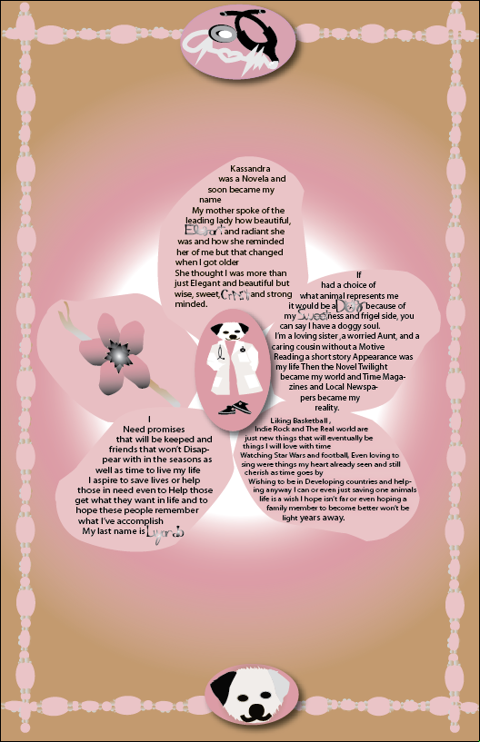
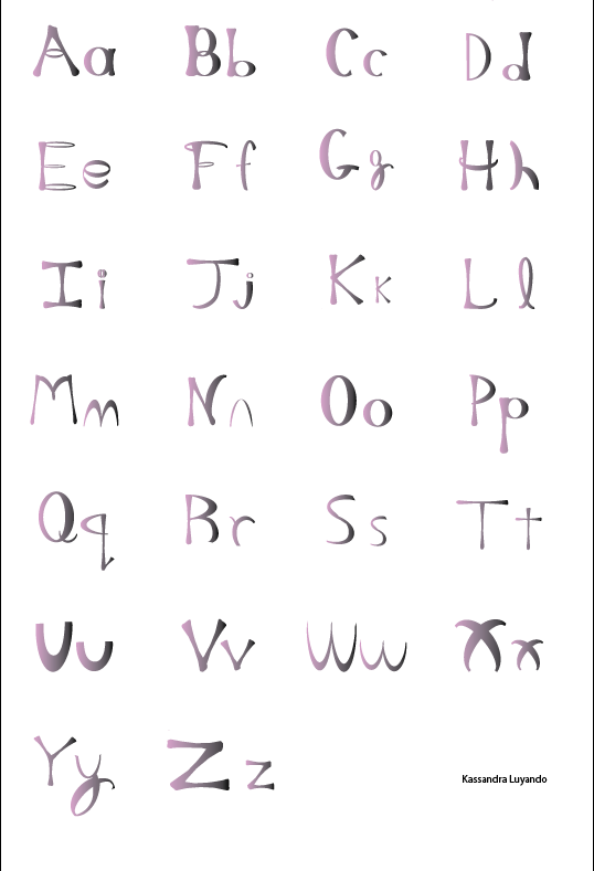
I was asked to write a poem about my character. then I was told to make personal symbols referencing to my personality. I also had to create my own alphabet and pick out key words from my poem. I had to make jesters with the keywords definitions . Then we had to make a poster with all of the projects from before. I learned about illustration and how the patterns lined around my poster could be used in a book, and a greeting card. I used the same materials from the last project the gradient tool which creates a gradual blend between multiple colors and the pen tool which creates paths with straight segments. I really didn’t follow any steps just went along with any ideas that came to my head. My poster has a beaded pattern outline and a flower in the middle. The pedals of the big flower in the middle contains my flower symbol  and My poem which is scattered within the other pedals. I definitely feel my poster fits every aspect of my personality as well as my

My alphabet reflective essay

Image
      The task of this project was to create the Alphabet's using the I's and O's design that we personally made. While going along with my creation, both I's and O's were formulated into the alphabet using the same colors from the last project! I learned how to use the pathfinders and envelope distorter in this project and I must admit, it was interesting! I used a lot of pathfinders because we had to arrange the I's and O's into all of the other letters in the Alphabet's; which was sort of difficult. While attempting to make certain letters like: M, L and J, I had to use the Envelope Distortion.        First I made the letter O and then I made the letter I. After that I made the letter Q as well as the other letters of the alphabet. when I was done I grouped the upper case letters with the lower case then arranged them vertically. Then I changed the letters to pink and black. The materials I used for this project was: gradient, pathfinder, envelope di

Vocab Poem

My life was Monochromatic until seeing Hue lights.  I sketch portraits of people I don't know to understand a stranger in a artistic way.  I always knew I was weird and no Illustration could convince or change my thought.  When looking at the sky I Believe you see compositions of what you want to believe. When trying to make a Equilibrium design wild but structure would be wise. I look in the mirror and see a silhouette of what I used to be Even if it would Pretend to  be abstract. My Colors of life have been tinted over time trying to Motif into me. One thing that will never change are the organic shapes we see everyday which we never seem   to admire even contour shapes can seem so plain.

My 4 Identity symbols reflective eassy

Image
We were asked to create symbols that represent who we are or want to be . We had to make  an animal symbol, tool symbol ,person symbol and a flower symbol. We were allowed to use two colors as well as black and white . As a graphic designer I learn different skills and in this project I realized you need a blueprint of your ideas and  your characteristics  . I used pen,and gradient which are tools from Illustrator.The colors I used for my symbols was pink ,grey, black and white. My animal symbol was first then my flower symbol was second because I kinda had an Idea for these two tasks. My animal symbol is a white puppy  that has  spiky hair and one ear is black and the other is grey like a  DALMATIAN. My flower symbol is a  blossom with pink peddles  and  blackish stars in the middle. My person symbol wasn't  really a person it was a dog's head with a white doctors coat and black pinkish converse, my favorite. My tool symbol is a stethoscope with a life line wire and a h

Graphic Design Vocab

Image
Monochromatic - containing or using one color Sketch - A rough drawing or painting, often made to assist in making a more finished picture Illustration - An example serving to clarify or prove something Contour -    one representing or bounding the shape or form of something. Equilibrium - A state in which opposing forces or influences are balanced. Design - A plan or drawing produced to show the look and function or workings of a building, garment, or other object before it is built or made. Composition -The nature of something's ingredients or constituents; the way in which a whole or mixture is made up.   Motif - A distinctive feature or dominant idea in an artistic or literary composition. Organic shapes - a shape that visually suggests nature or natural forces. Portrait - A representation or impression of someone or something in a painting, drawing, photo

Blog Use

            We had to create a blog to get our art work online and learn to connect with other people about our or other art work.                                                                                                                                                                                            If you make a fantastic b log A company will admire your hard work and want you to hype up their product.you can get paid for it and if a college sees the effort you put in your blog their going to be fascinated .                                                                                                                                            Blogs are  used to get your ideas and work or business popular and known. blogs are usually  created by music arts, Fashion designers and Critics but anyone can make a blog.                                                                                                                                                     
Graphic design is my Art and Voice, its also m y understanding of the future so enjoy my blog