My alphabet reflective essay
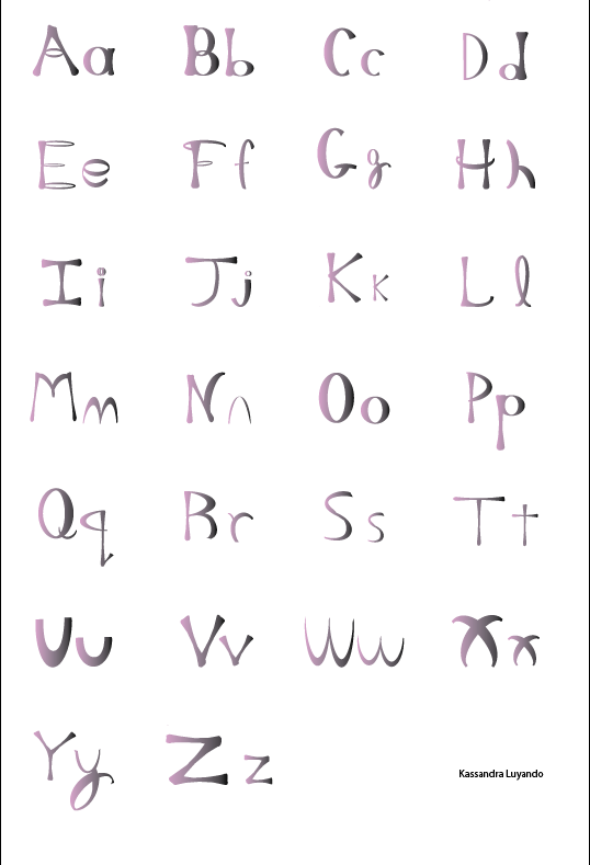
The task of this project was to create the Alphabet's using the I's and O's design that we personally made. While going along with my creation, both I's and O's were formulated into the alphabet using the same colors from the last project! I learned how to use the pathfinders and envelope distorter in this project and I must admit, it was interesting! I used a lot of pathfinders because we had to arrange the I's and O's into all of the other letters in the Alphabet's; which was sort of difficult. While attempting to make certain letters like: M, L and J, I had to use the Envelope Distortion.
First I made the letter O and then I made the letter I. After that I made the letter Q as well as the other letters of the alphabet. when I was done I grouped the upper case letters with the lower case then arranged them vertically. Then I changed the letters to pink and black. The materials I used for this project was: gradient, pathfinder, envelope distort, and the knife tool. The document had to be letter sized and I used the Guidelines to help me with the size of the letters.
If I had to describe my work to a blind person, I would tell him/her that my Alphabet letters looks like bones put together. My A looks like an upside down V with a halo in the middle. Along with the other letters of the Alphabets are just combinations of bones and halos.
During this project, creating my alphabet was slightly difficult. I wanted it to be smooth but sharp. The design I had in my head was cursive because it looks classic and smooth. I also thought initiating the lower case alphabets completed my work because it follows through with my layout! Once I figured out what I wanted my table to look like everything became much easier to make. The challenging part was making the letter Y. It was difficult, but looking at the lowercase g helped quite a bit! In my belief, I find some sort of relation with my personality and this project. It's fancy, sharp, crazy and wild! It described me and my personality, I guess it's why I love it so much!
Explaining to what I said before about it being interesting, the assignment was to make something from my creativity and perspective. I love how Ms. Carol put my mind to work. While putting this project together, I expanded my thoughts and put my ideas and theories to test! I've learned that graphic design takes time and patients, I know now that I can't just slap something together and call it artwork. Things like this needs a lot of preparation! I wasn't too naive about the software since I've taken a couple of classes in previous occasions, but refreshing my memory does help a lot.
I've learned that I have become familiar with Illustrator and I'm proud of myself because I've grown patients to make something that didn't make me fuss! As I said before, the whole project itself was fine, it was just certain parts of the Alphabets gave me difficulties. I over came it by looking at similar shapes to make the letters. I've looked for inspiration to push me and complete this project. If i had time to fix it, I would probably add more brighter colors instead of sticking to pink and black, but because I didn't, I'm content with the colors I have now!
Well, considering to what I said before, I've actually used my previous knowledge to help me in this class. Also, I would like to say guidelines could actually help me in my math or physics class. It can help make me more accurate and persistent. I can use this assignment to help me in the future by creating advertisement, commercials, film making, dialogues and more! If I was a graphic design major, this would actually be my pedestal.

Comments
Post a Comment